Wednesday, October 22nd, 2025, 10:31 PM — 6 months ago
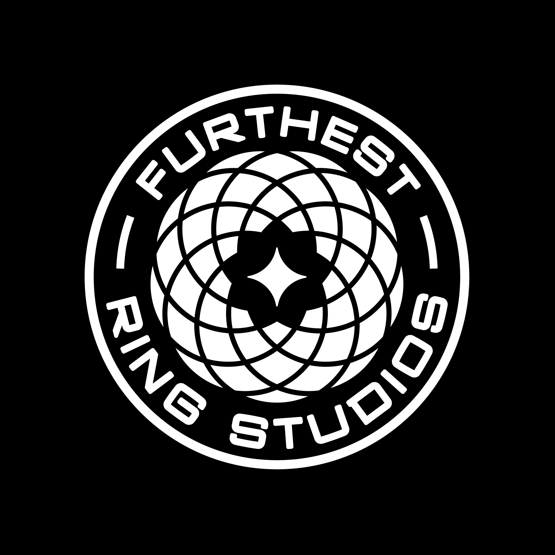
The Homestuck Independent Creative Union has rebranded with a cool new logo! It's really cool and harkens to the classic Sburb spirograph, although to my slight chagrin, it is not quite the same spirograph... The ratio of the fixed circle's radius to the rolling circle's radius is a bit messed up, and so the negative space-shape in the middle has 9 points instead of the original 10, but I am admittedly nitpicking the fuck out of this and need to calm down.
Very much a cool design! And the name is a lot more fun than the generic one we had earlier.
If you want to read the official post with the name change and explanation, visit https://beyondcanon.com/news/furthest-ring-studios

 The technique is to use hot oil to elicit a response
Loading replies...
Topic: HICU has rebranded to Furthest Ring Studios