MSPFA panel help

Before posting on the forum, be sure to read the Forum Rules.
Friday, August 8th, 2025, 6:29 AM26 days ago

Before I move on to drawing the other panels, I need to know if this sequence looks good for being the first two panels of my MSPFA


Introduction panel


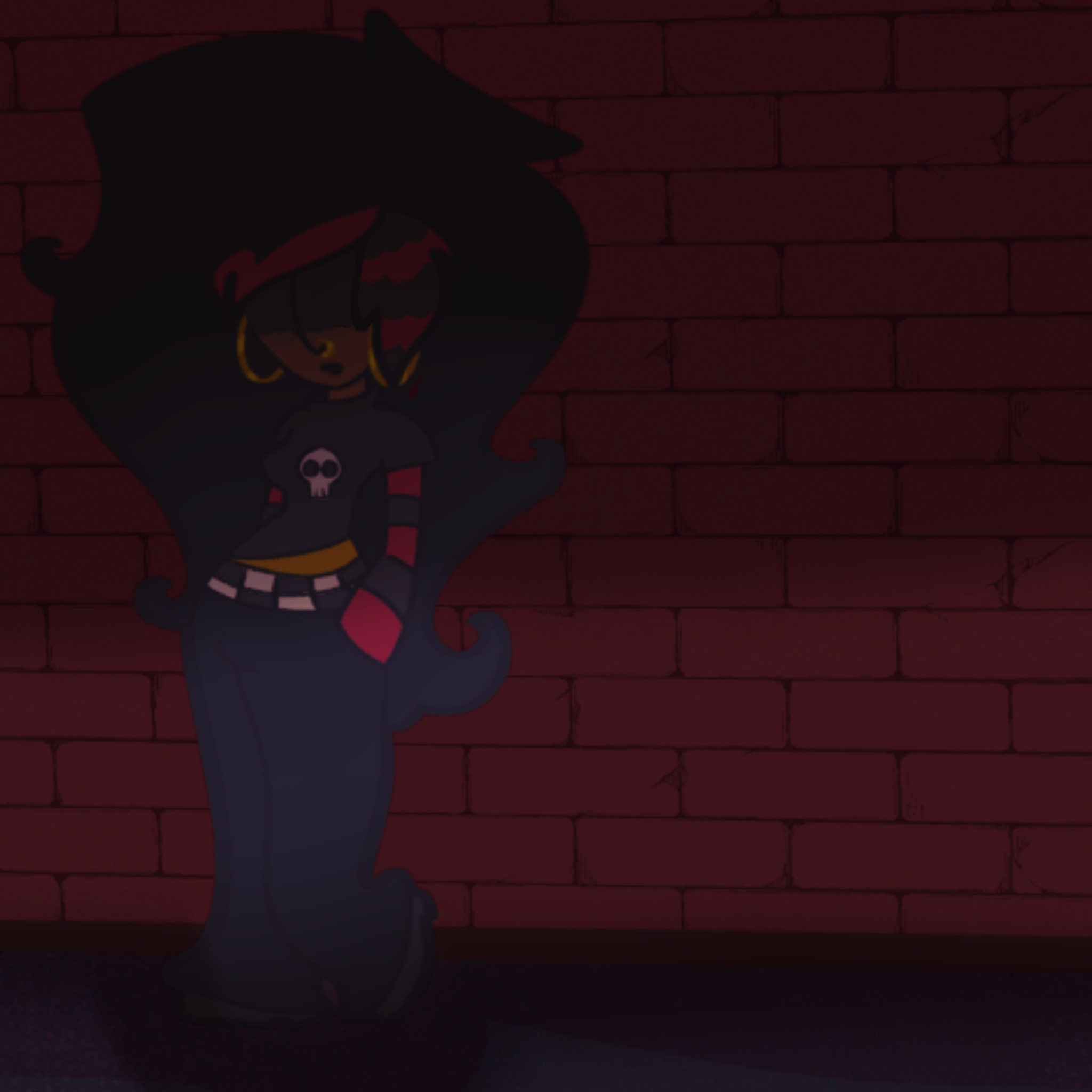
There appears a mysterious girl


Is this too weird looking? Too flat? I do want it to have a sort of flat feel but Im worried that it looks weird with the rendering and shadows / lighting in particular. I'm struggling with simplifying this...

CREATOR OF FORCES OF WHAT?!


Luca Rose
Friday, August 8th, 2025, 7:53 AM26 days ago

I'm not an art person but from a laymans perspective it looks great! The whole red theme and the stars in the sky look amazing. not to mention the character art, as long as you have some sort of engaging hook story wise I'd certainly be invested

Please foward all messages to your mothers house

AwesomeLoser
Friday, August 8th, 2025, 1:09 PM26 days ago

i think the color and design choices are good, though i'd show a more direct relationship between the character and the building they're up against, so we have a better grasp on the space and the character in it.

SHAPED OR MOLDED FORMS appear to have been formed from a plastic material through directly applied force.

ABSTRACT FORMS are of uncertain origin.

Friday, August 8th, 2025, 2:27 PM26 days ago

@victoria

what would be good advice on doing that? I have a separate drawing with the whole building and her as a backup copy

CREATOR OF FORCES OF WHAT?!


Luca Rose
Friday, August 8th, 2025, 2:47 PM26 days ago

I think the building in the first panel is a bit too featureless. Add some details— gutters, pipes, windows, posters, laundry lines, ect. Having those continue into the second panel will help tie them both together. I think the color is a bit monotonous and I’d want to have a contrasting color to make it a bit more visually interesting, but that’s a stylistic choice, it’s fine as it is.

Hareofhrair
Saturday, August 9th, 2025, 7:58 AM25 days ago

Honestly I think what's making it look a bit flat looking is that shadow overlay you have over the second panel. When doing a flat colored MSPA style, the drawings are inherently "flat", but they don't necessarily feel flat. When you add a straight gradient shadow like that over it, however, it draws attention to how simple the coloring/shapes in the style are and MAKES it feel flat. I'd either change the shadows to being cell shaded or just do away with the shadow entirely.


Hobsyllwin
Saturday, August 9th, 2025, 1:47 PM25 days ago

I think the art itself is great but that shadow effect is way too much. Instead of giving the impression that it's dark, it just makes it hard to see anything, which is a shame - that character design and pose is awesome.

"This is StuckUnderHell, nor am I out of it." - Mephistopheles


Bandersnatch Wrangler
Saturday, August 9th, 2025, 6:14 PM25 days ago

Is this better?


Intro


CREATOR OF FORCES OF WHAT?!


Luca Rose
Topic: MSPFA panel help